- My Top 12 Chrome Extensions
- NewSpring Gets a New Logo and a Lot More
- Give Wikipedia Some Class with WikiWand
- Instagram Saves Your Videos from a Case of the Jitters with New App
- The Best Car Mount for Your Mobile Phone (and It’s On Sale)
- The Best Road Trip App Available
- Track (and Accomplish) Your Goals with the new Full App
- Google Glasses at Church?
- Your New Right Arm
- Doh! The Simpsons Come to Moleskines
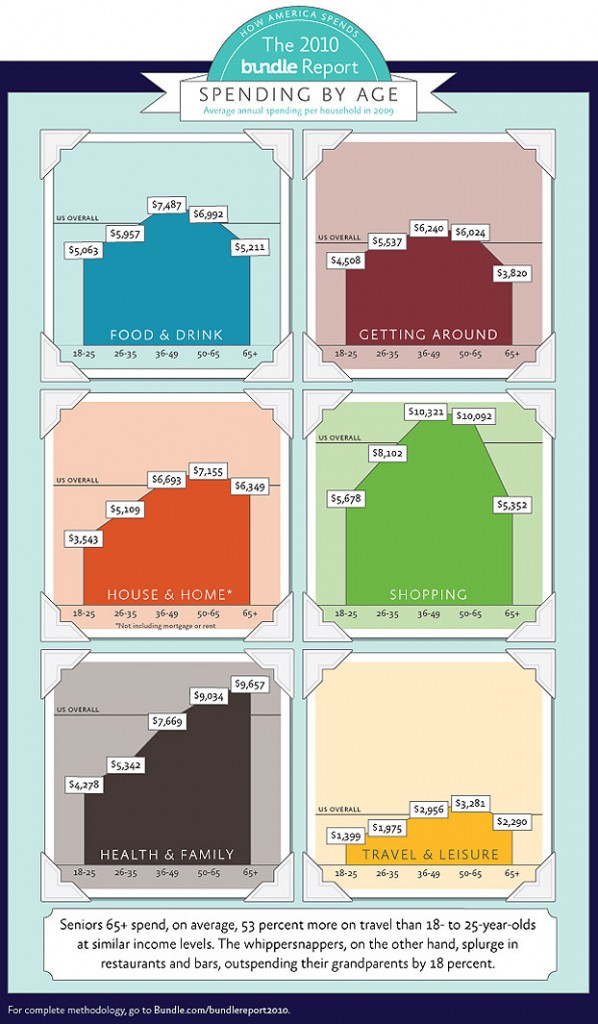
Graph: Spending by Age
Very interesting data about how different age groups spend their money. It would have been nice to see what charitable giving looks like for each group too. What do you think this mean for churches, if anything?
More details are available here.
via Bundle.com
Latest News
-
My Top 12 Chrome Extensions
Chrome is my browser of choice for a lot of...
- Posted November 5, 2014
- 4
-
Microsoft Increases OnceDrive’s Max File Size
If you’re a OneDrive user that likes BIG files then...
- Posted September 12, 2014
- 0
-
Watch Twitter Light Up as Apple Announces New Products
When Apple announces a new product it’s always big news....
- Posted September 12, 2014
- 2
-
Samsung Has Some Fun at Apple’s Expense [Video]
Whether you’re a Samsung fan or an Apple fanboy, you...
- Posted September 12, 2014
- 2
-
Release Your Inner Tycoon with the New Acorns App
Many years ago, a small site called Mint was launched....
- Posted September 6, 2014
- 2
-
The Moto 360: It’s Awesome! It’s Amazing! It’s Already Sold Out!
Motorola launched their new Moto 360 smartwatch yesterday at noon...
- Posted September 6, 2014
- 7
-
Google’s New Photo Sphere App Blows Away All Panoramic Photo Apps
Panoramic photos are cool and all but they’re so last...
- Posted September 4, 2014
- 5
Join the Fun on Facebook!
-
Microsoft Increases OnceDrive’s Max File Size
If you’re a OneDrive user that likes BIG files...
- September 12, 2014
- 0
-
Watch Twitter Light Up as Apple Announces New Products
When Apple announces a new product it’s always big...
- September 12, 2014
- 2
-
Using Mind Maps in Sermon Prep [tutorial]
In this video tutorial, I’ll show you how I...
- August 25, 2010
- 77
-
Two Great Service Planning Sites
Planning services, selecting songs and schedule volunteers can be...
- July 22, 2010
- 10


